Plotting and Visualization
Cedalion’s visualization modules cover three levels of output:
Time-domain plots (
cedalion.vis.timeseries) — channel time traces, haemoglobin concentration time courses, and epoch butterfly plots for quality checking and results communication.Scalp-level maps (
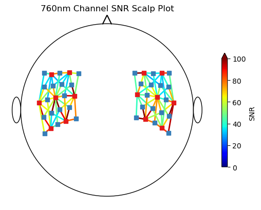
cedalion.vis.anatomy) — project channel-space values onto a 2-D scalp topography or onto a 3-D scalp mesh. Includes sensitivity matrix visualisation for assessing channel coverage.Quality summary (
cedalion.vis.quality) — channel-by-channel quality dashboards showing SCI, SNR, and motion artefact flags.
Plots are built from composable building blocks in cedalion.vis.blocks (individual
channel waveforms, quality colorbars, etc.) and cedalion.vis.colors (colormap
utilities). For 3-D rendering Cedalion uses PyVista; 2-D plots use Matplotlib.
Two Qt-based interactive GUIs are available for manual inspection:
Time series inspector —
cedalion.vis.misc.time_series_guiProbe montage viewer —
cedalion.vis.misc.plot_probe_gui
These subpackages contain building blocks to assemble visualizations:
Blocks of plotting functionality to build visualizations. |
|
Color and colormap definitions. |
The functions in these subpackages create complete plots for different usage scenarios:
Tools for visualizing data on brain and scalp surface representations. |
|
Plots an fNIRS probe's sensitivity profile on a 3D brain surface. |
|
Tools for visualizing signal quality metrics and masks. |
|
Tools for plotting temporal data. |
Cedalion contains two Qt-based GUIs for inspecting time series and probes:
Interactive GUI to view the HRF in probe space after data has been processed. |
|
Interactive GUI to plot fNIRS probe and channel time courses. |